

10 Shopify Design Patterns Every NI, Irish & UK Business Should Steal in 2026
Exploring the latest trends and strategies shaping e-commerce in 2026. Stay ahead with cutting-edge insights and actionable advice.
10 High-Converting Shopify Design Patterns for NI Stores (2026 Edition)
If you run a Shopify store in Northern Ireland, you’ve probably felt this frustration before:
“We get the traffic. Why aren’t more people buying?”
Here’s the truth: Most stores aren’t struggling because of their product or their traffic source. They’re struggling because their design patterns are 3–5 years out of date.
Many local sites still rely on cluttered layouts, aggressive pop-ups, or generic templates that fail to build trust with international or even local buyers. At Invisible Building, we don’t design for aesthetics alone. We design for revenue.
We’ve analysed real user sessions across Belfast, Dublin, and the wider UK to find what actually works in our unique market. Here are the 10 UX patterns every NI Shopify brand should be stealing in 2026.
⚡ Quick Summary for NI Founders:
Stop focusing on abstract "branding." Focus on clarity, speed, and trust. The 10 patterns below are designed to specifically reduce bounce rates and increase trust for UK & Irish shoppers.
The Cheat Sheet:

1. The “Hero That Sells, Not Tells” Pattern
Your homepage hero section is the most valuable real estate on your entire website. Yet, too many businesses waste it on abstract slogans like "Passion for Quality" or massive image sliders that slow down the page.
In 2026, customers don’t want poetry. They want clarity. Within 50 milliseconds, your hero must answer three questions:
- What do you sell?
- Who is it for?
- Why should they care?
The Winning Structure:
Stop using rotating sliders. Instead, use a static, high-impact layout with a clear headline, a one-sentence value proposition, and one single Call to Action (CTA). Don't split their attention between "Read our Blog" and "Shop Now." Focus entirely on the sale.

2. Story-Based Product Pages
Specs tell, but stories sell. The old Shopify template (Title → Price → Description) kills conversion because it forces the user to do the mental work of imagining the product in their life.
The highest-converting NI stores are now treating product pages like landing pages. Instead of a dry bullet list of materials, they weave the features into a narrative.
Modern Product Page Structure:
- Meaningful headline: Hook them immediately with a benefit, not just the product name.
- The transformation: Describe how life gets easier or better after the purchase.
- Unique advantage: Why should they buy from you instead of Amazon?
- Proof: Use reviews & press logos to validate the claim.
- Lifestyle gallery: Show the product in use, not just on a white background.

3. The “Three Reasons to Trust Us” Strip
This is a quick-win UX pattern that we see on almost every high-performing local site. It is usually placed right under the hero section or immediately above the footer.
For Northern Ireland businesses selling into the UK or ROI, "Border Anxiety" is real. Customers worry about customs, currency, and slow shipping. You need to address this immediately.
- Free NI, UK & ROI Delivery
- NI-Based Support Team
- Hassle-Free Returns

4. The 3-Click Checkout Journey
Friction destroys profit. Every time you ask a user to click, load a new page, or fill in a form field, you lose a percentage of your sales.
We are seeing a massive shift toward specific "Express Checkout" buttons (Shop Pay, Apple Pay, PayPal) being prominent not just in the cart, but directly on the product page. If a customer has to click more than three times to go from "Product Page" to "Order Confirmed," you are leaving money on the table.

5. Sticky Add-to-Cart (Clean, Not Spammy)
When a user is on their phone scrolling down your detailed, story-driven product description, the "Add to Cart" button usually disappears off the top of the screen. If they decide to buy, they have to scroll all the way back up. That is friction.
The solution is a Sticky Add-to-Cart bar that anchors to the bottom of the mobile screen. However, it must be designed well. Avoid aggressive, flashing colours. A clean, white or soft grey bar with a clear button and a tiny trust badge works best. It ensures the primary call to action is always within the "thumb zone."
6. The “Smart Mega Menu” for Large Catalogues
If you have a large SKU count, a standard dropdown menu is a conversion killer. A long list of text links overwhelms the user, leading to "Decision Paralysis."
The "Smart Mega Menu" uses imagery and hierarchy to guide the user. Instead of just text, use thumbnail images for your top collections within the menu itself. You should also include a "New Arrivals" block with a product image directly in the navigation. This allows users to "window shop" before they even click a link.
7. Bundles That Increase AOV Instantly
With ad costs rising, the most effective way to increase profit is by increasing your Average Order Value (AOV). But don’t just rely on the customer to browse and pick three items themselves.
Design the bundle for them.
- Build-Your-Own Boxes: Let them mix and match flavours or styles.
- Quantity Breaks: "Buy 2, Save 10%" is a classic for a reason—the math is simple.
- The 'Starter Kit': Combine a best-seller with necessary accessories.
8. Social Proof That Doesn’t Feel Cringe
Stock reviews are out. Authentic User Generated Content (UGC) is in.
In 2026, a generic 5-star graphic means very little. Customers are skeptical. They want to see real people using the product. The best-performing stores are using layout blocks that feature real Instagram/TikTok photos from customers, with the review text overlaid. Seeing a real person in Belfast or Dublin holding the product validates it instantly.

9. The TikTok-Optimised Product Page
Shopping behaviours are changing. Gen Z and younger millennials are accustomed to vertical video and constant motion. Static image galleries are starting to feel outdated.
The winning pattern is integrating short-form, vertical video (Reels/TikTok style) directly into the product image carousel. Don't force them to click a YouTube link. Have the video auto-play (muted) showing the fabric moving, the food steaming, or the gadget in action. Motion builds trust faster than text ever can.

10. The 2026 “NI Shopify Look”
There is a distinctive aesthetic emerging among top-performing Belfast and NI brands. It breaks away from the cluttered, "shouty" style of dropshipping sites often seen across the Atlantic.
The look is Cleaner, Calmer, and Confident. It relies on generous whitespace, typography that breathes, and high-fidelity local photography. This "quiet luxury" approach signals to the customer that there is a real business, with real people, standing behind the URL.
📈 Final Thought — Good UX Pays for Itself
These patterns aren’t just theory. They are the exact patterns we use at Invisible Building to help NI brands convert better, sell more, and look world-class.
The question is: Which of these should your store implement next?
Want us to review your store?
Book Invisible Building for Shopify services todayEnjoyed this? Try one of these:
-

Cupán Focail: Reviving the Irish Language One Cupán Caife at a Time
Read More → -

Visit Belfast in July for Belfast Whiskey Week
Read More → -

The Work That Made Us Go All-In on Shopify
Read More → -

A Small Update, A Clear Intention: Our New Events Page
Read More → -

What Belfast Shopify Businesses Really Want (According to Our Clients)
Read More → -

Independent Irish Shopify Studio Values | How We Work at Invisible Building
Read More → -

Looking Back at Magic at Moira: 10k Views, The Santa Run, and Building Something That Lasts
Read More → -

Free Shopify Training in Northern Ireland: How to Skill Up with Go Succeed
Looking for free Shopify training in Northern Ireland? Go Succeed offers funded expert worksho...
Read More → -
Shopify SEO Tips for Northern Ireland Businesses
Read More → -
From Wix to Shopify: Why It’s Time to Level Up Your Store
Read More → -

Smart Shopify Websites: How Invisible Building Uses AI to Power Performance, Design & Growth
Read More → -
Northern Ireland Shopify Success Stories: 5 Brands That Sailed Past £1 Million
Read More → -
15 Must-Ask Questions Before You Hire a Shopify Developer (+ Free Checklist)
Read More → -
How to Source Products for Your Shopify Store in NI?
Read More → -
Inside the Build: 4 Case Studies from Invisible Building
Read More → -

How We're Using ChatGPT and AI to Boost Creativity and Output at Invisible Building
Read More → -
111 Songs to Get You Motivated While Working
Read More → -
Belfast drone footage meets creative strategy
Read More → -

From CSS to Stud Walls: Invisible Building Goes Full Bauhaus
Read More → -
What to Post This Month: NI Social Media Calendar for April 2025
Read More → -
The Ultimate NI Small Business Toolkit
Read More → -
How Shopify Store Owners Can Use what3words to Improve Deliveries and Customer Experience
Read More → -
How New Businesses Can Use AnswerThePublic to Grow
Read More → -
The NI Business Facebook Group
Read More → -
E-Commerce Trends and Best Practices for Northern Ireland Shopify Businesses (2025)
Read More → -
Valentine’s Day Shopify Success: Tips & Inspiration
Read More → -

Content Marketing Ideas for Shopify Stores in 2025
Read More → -
Turn Swipes Into Stories - How to Make an Instagram Carousel Feel Like an Animation
Read More → -

How to Write and Publish a Blog Post on Your Shopify Store
Read More → -

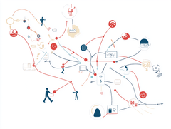
Mapping User Journeys: Charting the User Experience
User Journeys Maps: User Journeys Maps are a wa...
Read More →


